Protect EveryJuan

The brand faced major identity inconsistencies—different wordmarks were being used across platforms, brand colors lacked coherence, and while the mascot logo had potential, it wasn’t versatile or scalable for diverse applications such as favicons, signage, or social posts. The existing character leaned heavily on a single cultural element (Barong), which limited relatability and flexibility.

How I Helped

I began by identifying the need for a unified, flexible, and culturally resonant identity. I developed a mascot logo system that would scale seamlessly across different formats while preserving its Filipino roots. The process started with a moodboard, focusing on character styles, local personality, and visual tone that would appeal to a Filipino audience.

From a series of sketches, I explored several directions before arriving at a simplified and modernized version of the previous character “Juan Matatag.” Key features of the final character included:

  • Salakot: A culturally iconic hat that represents the common Filipino and symbolizes protection and solution, aligning well with the brand’s mission
  • Happy face and simple lines: To maintain relatability and visual clarity at all sizes
  • A clean, adaptable form that retains identity across digital and print platforms

For the wordmark, I used Nexa Text and Slab, a slab serif typeface that combines
readability with a trustworthy and familiar Filipino vibe.

Outcome

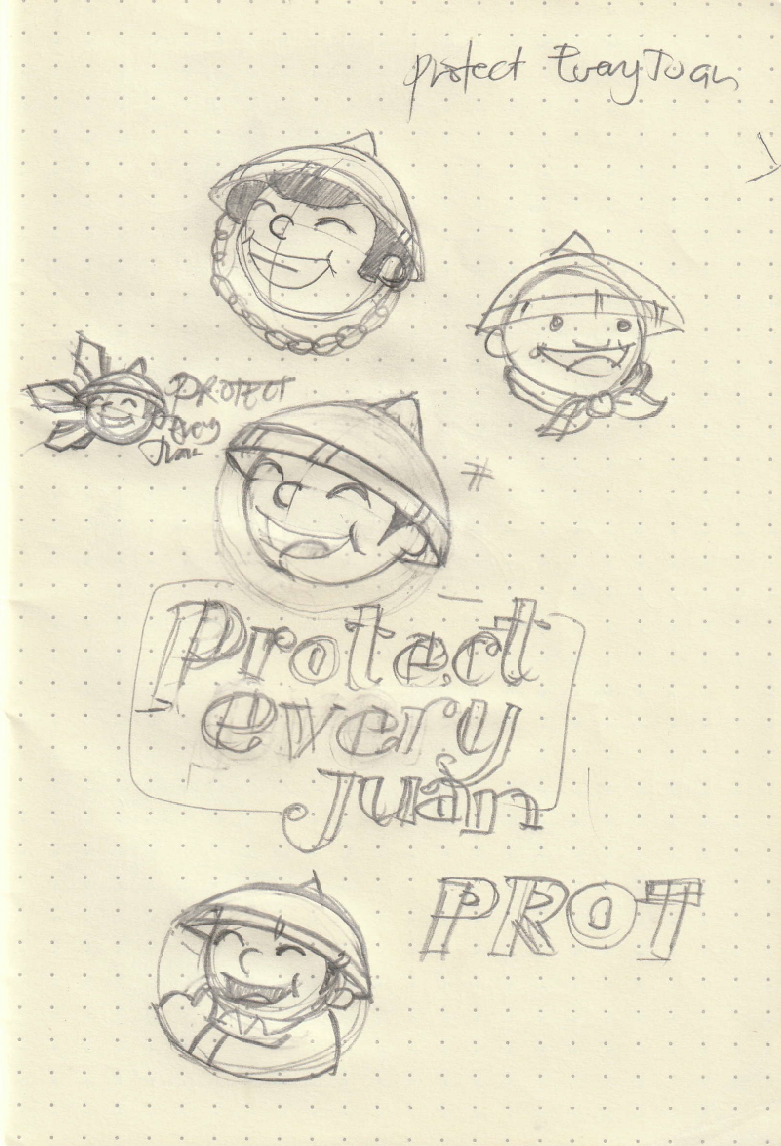
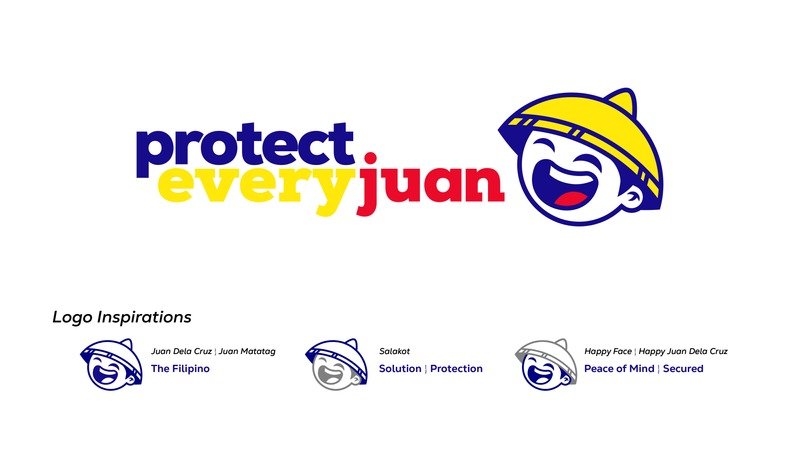
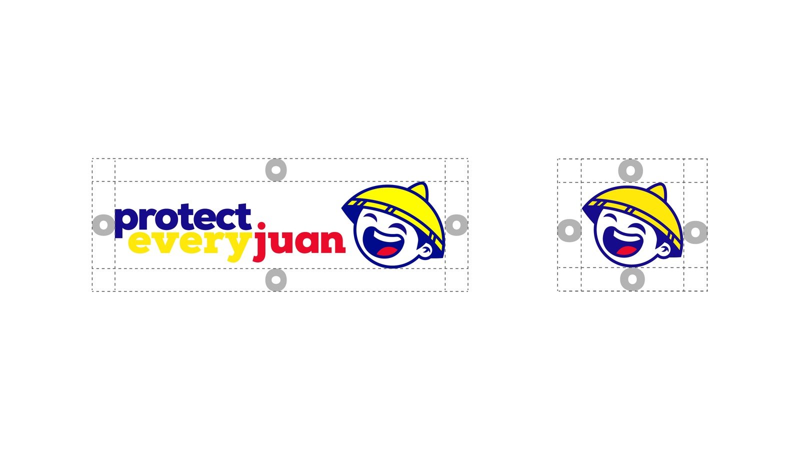
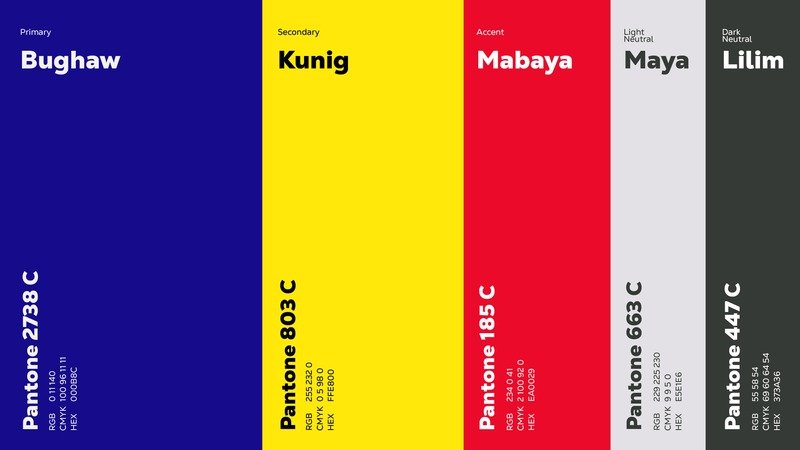
The new identity brought clarity, coherence, and cultural pride to the brand. With a simplified character icon and consistent design system, the visual identity now adapts effectively to any platform—from billboards to favicons—while strongly representing its Filipino roots and values.