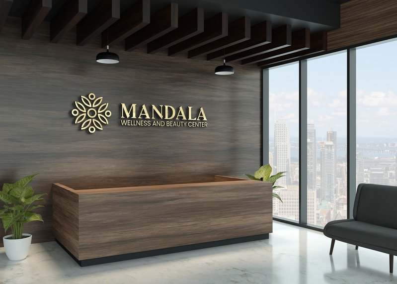
Mandala’s existing logo struggled to communicate its brand essence. The icon and typeface felt disconnected, overly complex, and lacked visual coherence. It wasn’t memorable, scalable across platforms, or aligned with the calming, rejuvenating experience they wanted to offer. Most importantly, it didn’t resonate with their target market—people seeking holistic wellness and beauty services.
How I Helped
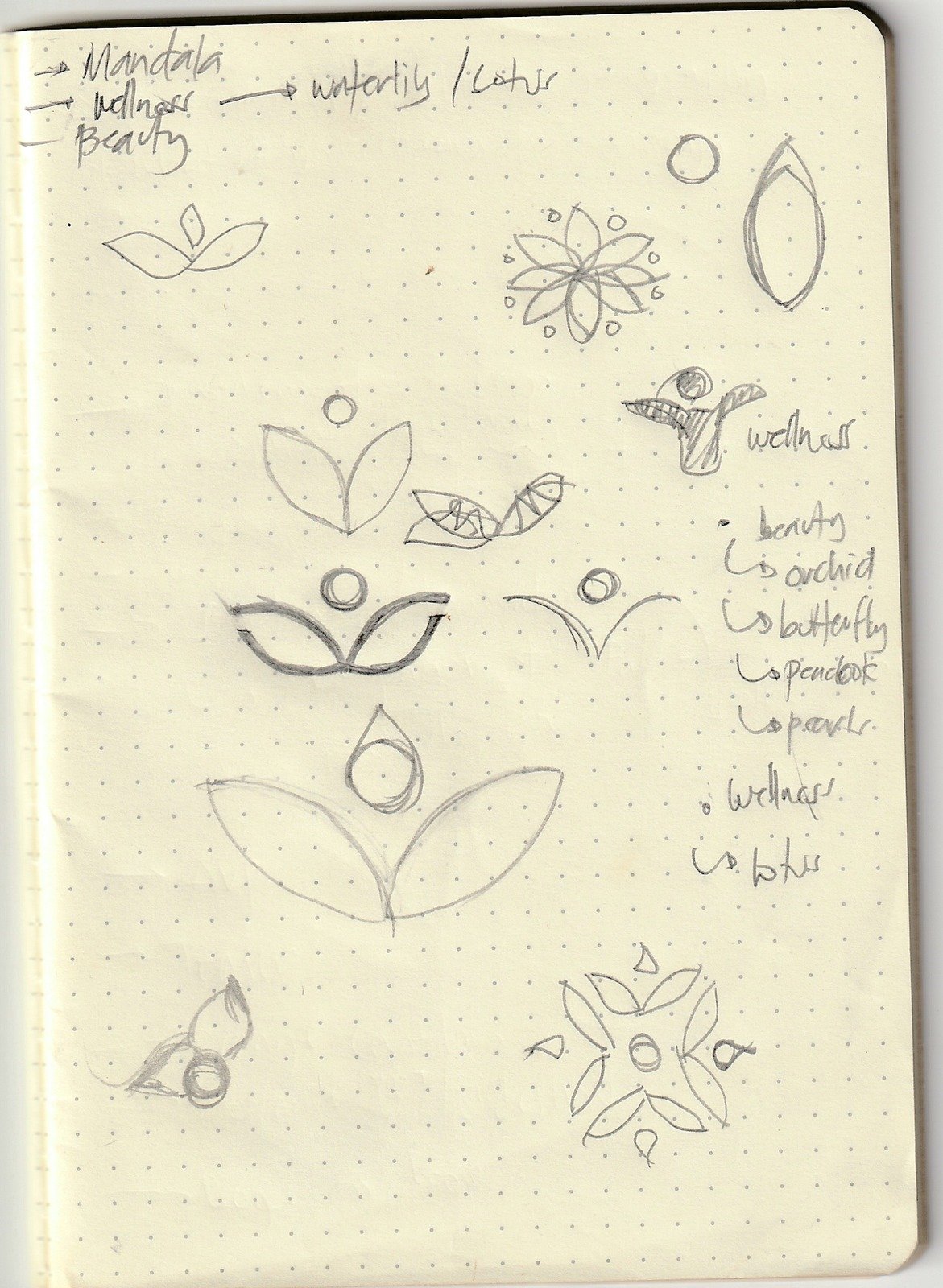
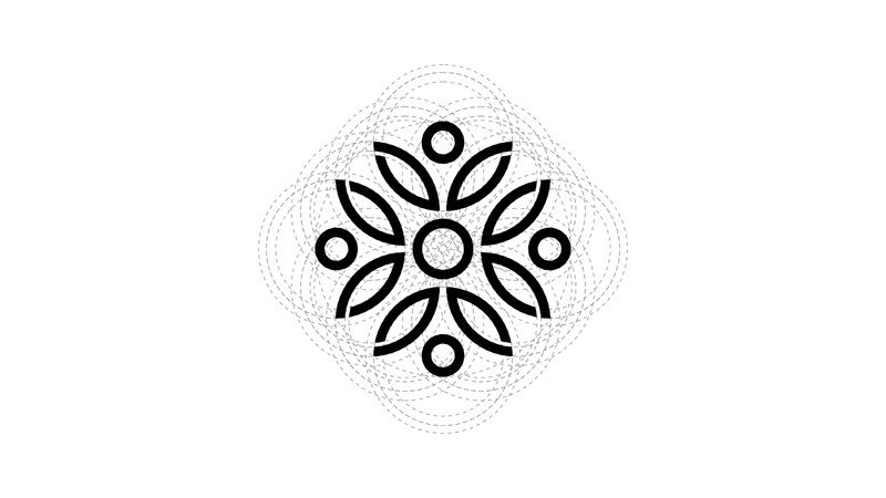
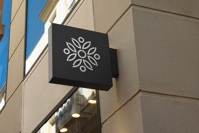
To reimagine Mandala’s identity, I began with hand-drawn sketches to explore visual symbols that represent both transformation and inner peace. I drew inspiration from the Lotus flower, a timeless emblem of wellness, balance, and spiritual growth, and the Butterfly, a symbol of beauty and transformation.
Scope of Work
Logo Redesign, Brand Symbolism, Custom Color Palette, Typography, Brand Pattern
Design System
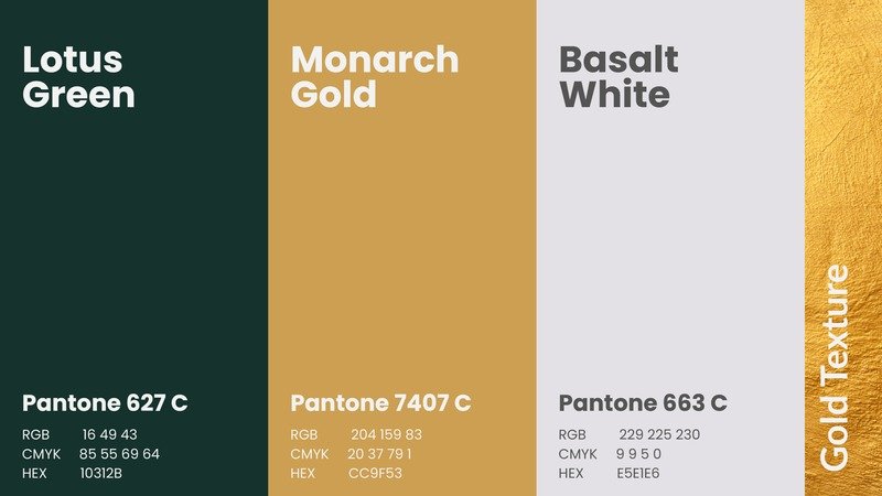
Color Palette: Lotus Green, Monarch Gold, Basalt White
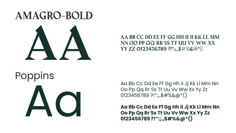
Typography: Amagro Bold for elegance, Poppins for modern clarity
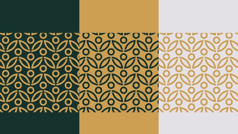
Pattern Design: Inspired by organic, symmetrical forms found in nature and wellness rituals
Outcome
A refined and meaningful identity system that communicates the essence of Mandala’s brand —elevating its presence across platforms and aligning it with its audience.